The Challenges of Developing for PC and Mobile. Part 2: Graphics
Planning and optimizing graphics
Written by Yohan Hervé.
When we first started on Leap of Fate, our original goal was to make a hardcore 3D action game that would feel equally at home on both PC and mobile. This article describes the thought process and technical decisions that helped us develop the game’s graphics. Although the focus is on 3D pipelines and optimization, we’ll also touch on our general graphical direction to start with.
Pre-production decisions
Pre-production is typically the phase in which you test hypotheses, make decisions and integrate all of your ideas into a coherent action plan.
Multi-platform. Our first big set of decisions was about planning the multi-platform development of our game. First, it is important to note that Clever-Plays is a small studio with myself as the only 3D artist (plus occasional help from freelancers), and so creating completely separate and optimal versions of the game for each platform was clearly not a possibility, time- and budget-wise. Instead, we would need to find ways for the game to be simultaneously pretty enough for PC, and optimized enough for mobile. Specifically, we quickly established that 3D models and animations were too work-intensive to be platform-specific, but that we could tailor textures and visual special effects (FX hereafter) to each platform. To do so, we would change the resolution and compression of the textures between platforms, and we would add FX, particles and post-processes on PC.
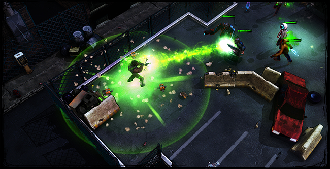
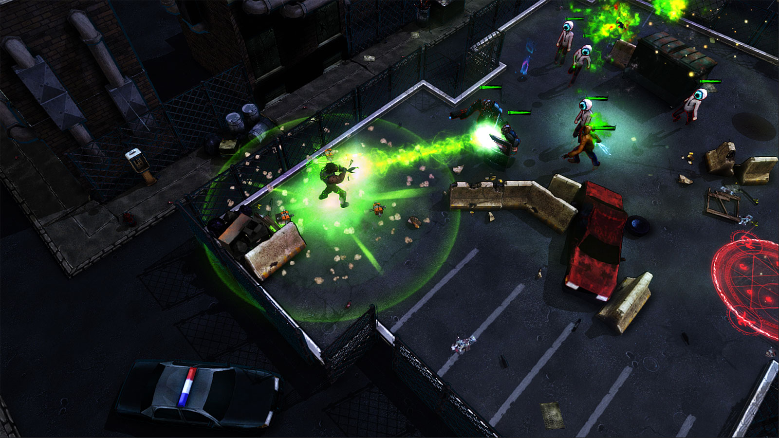
Gameplay. Next, given that Leap of Fate is a fast-paced, gameplay-focused game, we quickly established that graphics should serve gameplay, and not the other way around. This was especially obvious for character and creature animations which, in order to fit gameplay timings, needed to be much shorter than what would have been ideal for a more visually focused game. Similarly, gameplay clarity was a major priority. Creature shapes and FX, in particular, had to be visually designed first and foremost as carrying gameplay information, as opposed to necessarily being flashy and exuberant. In the same way, FX needed to avoid hiding the action behind them. Overall, we determined a priority order for how much each type of element needed to stand out visually in a scene, from most to least:
- Visual effects and attack animations. This category most directly contains gameplay information, so these had to be more visible and flashy than the rest.
- Creatures. These indicate the position of threats, and their shapes provide important hint on their gameplay function (melee, shooter, caster, etc).
- Player characters. Although important overall in the game, they are not the focus of attention during gameplay. Instead, the player’s eyes typically scan the surrounding region to locate threats.
- Environment. The main function of the environment is to create the level’s layout and to set the mood. As long as this is achieved, these assets should not attract further attention.
Art style. Combining the above priority list with our multi-platform constraints helped determine the visual style of the game, which we describe as having a realistic basis with cartoonish exaggerations and a comic book feeling. This style is somewhat similar to that of League of Legends or Borderlands and is based on hand-painted textures. This was chosen because it implied lower texture weights and less work for us. Indeed, hand-painted textures allowed us to get away with less details and taking more liberties. Similarly, an exaggerated art style allowed a wider palette of shapes and forms to convey gameplay information.
Optimization and graphical techniques
Now that the direction was set, the remaining challenge was to figure out a good compromise between quality and optimization for each individual type of asset. This was a process of trial and error, as every time we moved an element up or down on the optimization-quality axis, it affected the amount of resources left for the other elements, which consequently had to be tuned.
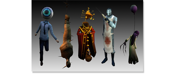
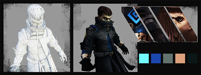
Characters and creatures. All non-crucial details in the models were strictly removed and simplified to ensure proper performance on mobile devices, and to leave more resources for animations. However, visual quality was preserved by transferring as much of the details as possible into the textures. As a result, creature models were made of 600 to 1000 triangles within a single mesh, except for specific interchangeable parts that were used to create variation between enemies. Creature textures were organized into level-specific atlases, to minimize texture weight and drawcalls.
Playable characters weighed a bit more, standing between 2,500 and 4,500 triangles, and their animations were also more detailed. This was necessary because characters were also used outside of combat, where details mattered more, but these numbers are still relatively small compared to more character-focused games.
Physics. The use of physics in a 3D game always comes with a heavy cost on the CPU. Considering our optimization requirements, every case where physics was needed had to be evaluated and only the most important ones would be kept. The case of creature death was problematic because there can be a lot of enemies on screen, dying at the same time. We originally considered not using ragdolls to save on CPU resources, and tried using death animations instead. However, that looked fake because every one of them died in the same way, and making multiple death animations for each of our 140+ enemies would have been too time-consuming. So we had no choice but to keep the ragdolls which, anyways, always feel more fun for players. To compensate, we had to go for a very simple rig and a low number of bones. Given the ragdolls, we could not also afford physics for the destruction of obstacles, so these ended up being fixed animations. To make the end-result nicer and more satisfying, we created the animations by baking a physics simulation, and added a cool explosion FX.
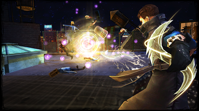
Special Effects. All of our FX were made directly in Unity’s particle system. Originally, we went with very simple shaders (alpha diffuse, additive and multiply), each containing only one field. We thought this would be the right way to maximize performance. However we soon realized that, while it made each particle light, we needed too many particles in each FX, which created too much overdraw and required a lot of memory usage. In addition, the total weight of FX in the game was non-trivial, given that there were hundreds of them.
After some research, we found a much more efficient, albeit more complex way. The new shaders were based on the formula TEX1*TEX2*2, and used sliders for different scrolling speeds, as well as individual UV settings. We’ve made many versions; some additive, some multiplying and some with three fields instead of two to cover every case optimally. Although each individual particle was heavier than before, this drastically reduced overdraw and particle numbers. For example, our basic fire FX went from 30-40 particles with the previous shader system to below 10 now. We generally made sure to not exceed 50 particles even for the most complex FX. The number of FX textures in the game also decreased significantly because of the heavy recycling that was now possible. As an aside, we’ve generally avoided using flipbooks, except for projectile impacts.
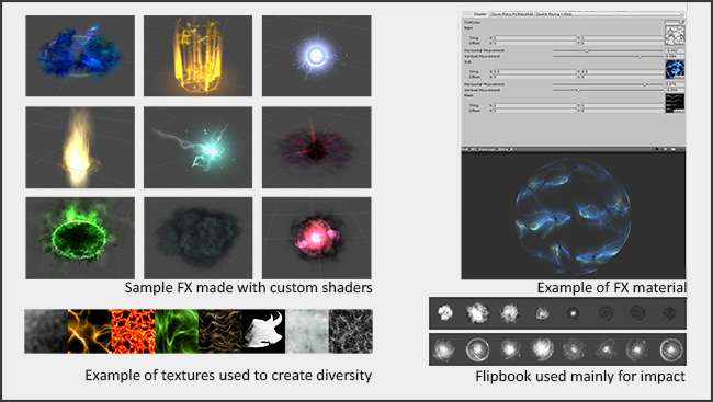
It’s worth mentioning that all of the mipmaps were done by hand, ensuring there’s as little difference as possible between the HD textures used for PC and the compressed ones on mobile.
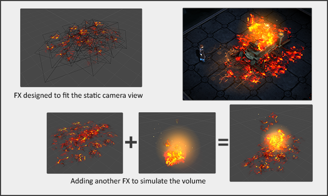
Finally, it’s always a good idea to look for practical ways to make some FX lighter. One method was to take advantage of Leap of Fate’s in-game camera angle, which does not rotate, thus building FX as optical illusions.
Environment. Everything about our 6 game levels was done with optimization in mind. Each level involved a minimal amount of textures to minimize drawcalls and memory. In each level, we used one atlas for the assets, one for the ground, one for the border and one for the obstacles. We avoided as much as possible the use of alpha in the scenery and in creatures, in order to have enough memory for FX, which were a higher visual priority. We only used the diffuse channel while the alpha generated the self illumination, and we did not use normal maps or multiple light sources, since the light was drawn into the textures. Finally, all mipmaps in the environment’s textures were deleted to keep the sharpness and definition of our hand-painted textures. Most importantly, it allowed us to reduce the size of the atlases. This did not cause a negative impact because our camera can never zoom out far enough.
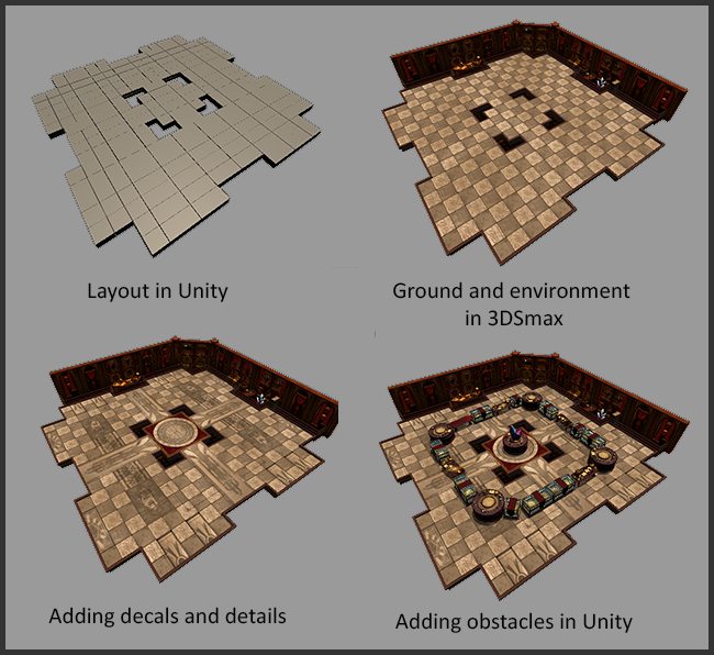
Creating the combat areas was a long and tedious task , as there are more than 120 in the game, not counting obstacle permutations in each. We actually tried to randomly generate the combat areas using modules, but that proved too difficult to optimize. Instead we chose to make every area by hand, which was the most efficient way to optimize each one precisely. For example, it allowed treating the background as a single object and allowed to cut meshes down to their minimum according to the camera angle. In the end, each area was composed of a ground, a set of invisible physics boundaries, decals and a single environment mesh. Obstacles were added individually after that. Since we had a single large mesh for the environment, we were very careful to not burst the tacit limit of 65,534 vertices, to prevent the engine from partitioning it and therefore increasing its total weight. Given the simplicity of the environment meshes, decals where especially useful to break the monotony of tiling textures.
Spicing up the PC version
The objective of all of the above-mentioned optimization techniques was to have a game that could run fluidly on our lowest supported devices, which were iPhone 5S and iPad 4. However, this came at a cost, in terms of overall graphical quality. Obviously, the PC did not benefit as much from this intense optimization, and so we needed to make sure the game looked nice on that platform. Our main strategy was to add post effects, more FX, and more complex shaders.
Environmental shaders were quite different between versions. On Mobile we used a diffuse map with self-illumination, whereas on PC, we used more complex shaders allowing, for example, simulated reflections, pulsating textures and normal maps. Character shaders were a bit less different between versions, but still had more fields on PC, such as specular, self-illumination or alpha.
On PC, we used some FX that were not used on the mobile version. In particular, we added atmospheric FX such as rain or magical dust, and we improved some creatures by giving them more effects like shiny eyes, for example. In terms of workflow, all of the FX that differed between versions had a home-made Unity script that automatically switched off the addition when building on mobile, which meant we did not have to duplicate everything. Most of the difference between versions, though, came from adding camera post-effects such as SSAO, HDR, blur, glow, or fog. This really made an impact in making the game prettier, more believable, and closer to PC standards.

Note that we did something similar with mobile, using a performance manager that would switch ON specific graphical elements on more recent and powerful devices, like sharper shadows, or more detailed mana particles. The mobile version however suffered less graphically from the heavy optimization because of screen size, and so the lack of details did not matter as much. That’s why most of our quality-improvement efforts went to the PC.
Conclusion
Developing a 3D game for platforms as different as PC and mobile really was a challenge. What helped us succeed was to define our visual priorities early, which informed our decisions on what we could change between versions and what we could get away with. In video games, there are always many technical ways to do things, and so it’s important to stay flexible and find clever tricks to cut where players won’t notice. For me, the biggest gratification was hearing players say “I can’t believe you managed to make Leap of Fate run so well on mobile”, while at the same time seeing comments about the game being beautiful. As a technical 3D artist, that’s when you know you’ve done your job.
Originally posted on Gamasutra : http://www.gamasutra.com/blogs/MattieuBegin/20161025/283995/The_Challenges_of_Developing_for_PC_and_Mobile_Part_2_Graphics.php


